Website redesign and rebuild for Music for Makers
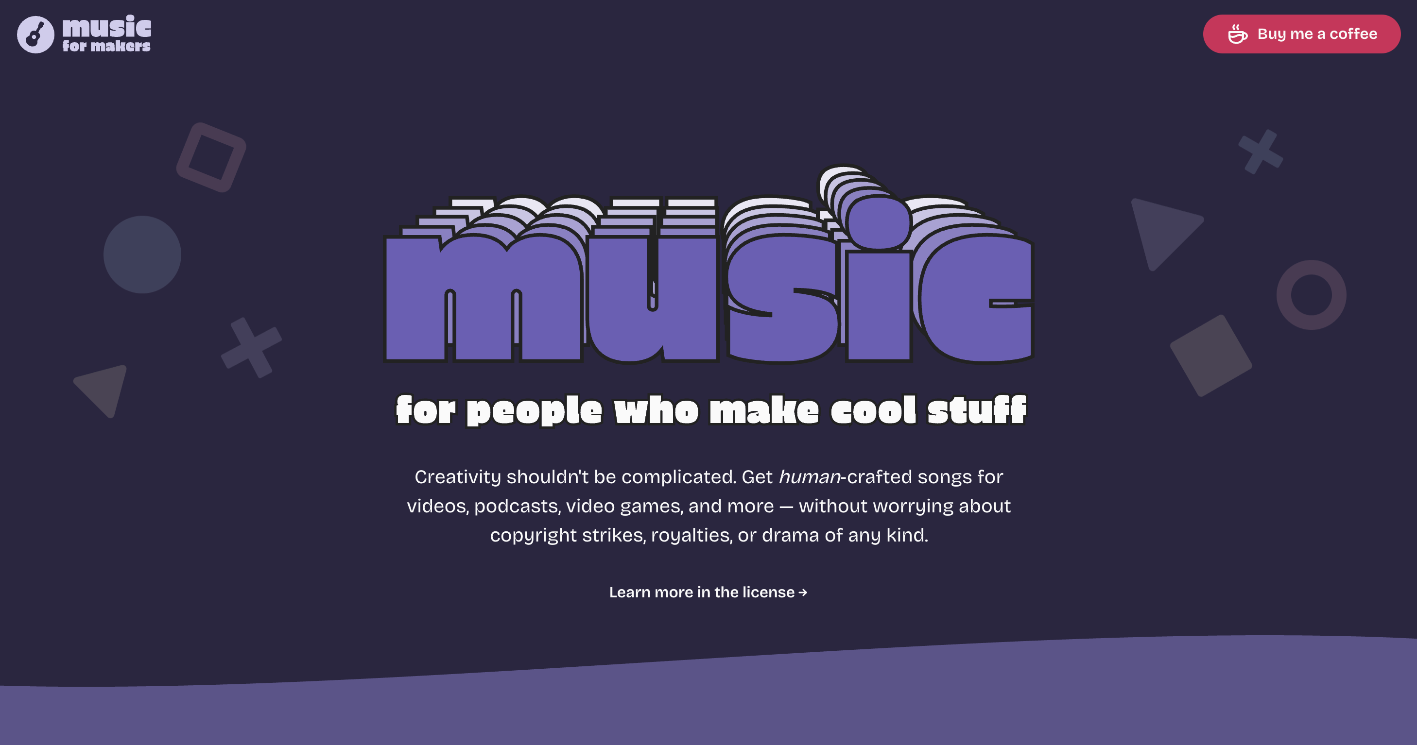
I started Music for Makers over a decade ago to simplify music licensing for people who make videos, podcasts, games, and other creative things. In 2024, I gave the brand a refresh and built a new site from the ground up.
Background
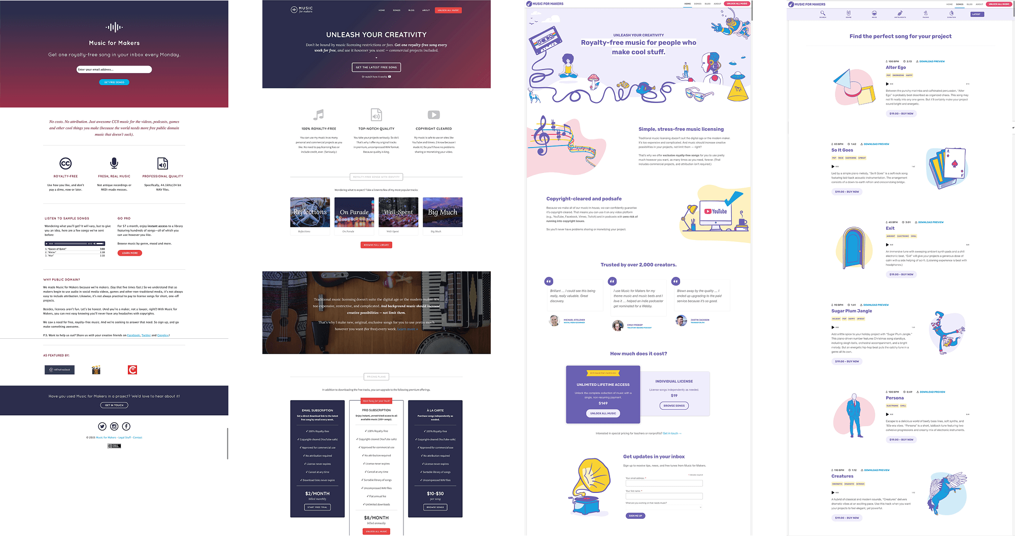
When I shipped the first iteration of the Music for Makers website in 2015, it was essentially just a landing page with a form. People could sign up to receive my self-produced, royalty-free songs by email every week for free.
Within just a few months of launching, the project had gained enough traction to warrant building out a bonafide music licensing (side) business with an online library of tracks for sale. I chose WordPress and its ecosystem of plugins to get a storefront up and running quickly.
Problems
The WordPress-powered site served me well for many years. But by 2024, it was showing its age, and problems were surfacing. Specifically:
- Archaic, bloated tech stack. WordPress became more cumbersome to maintain, so I didn't maintain it, which made it more of a nightmare to maintain. And the cycle repeated.
- Outdated UI/UX. I refreshed the design in 2019, but it was beginning to feel stale and no longer reflected my skills as a designer.
- Decreasing performance. I'd stopped spending time on the project, and profit margins were starting to suffer. It was time to re-examine the business model.
To solve these problems, I needed a modern website that would be fun to work on and as self-sustaining and cost-free as possible. So, I decided to rebuild the site from scratch and, along the way, refresh the brand with new typography and creative elements.
Process
First things first, I reviewed both quantitative and qualitative data (e.g., web analytics and surveys) to discover opportunities to improve. Insights gleaned included:
- Where users experienced friction. The site was sluggish, and most people who visited the homepage immediately clicked through to browse music.
- The features that were missing — and those I could sunset. People used only a fraction of the music filtering options available. Meanwhile, the site lacked many quality-of-life features, such as dark mode and keyboard controls.
- What users valued most. Survey responses indicated ease-of-use was a critical brand promise. My core audience of small creative businesses and solopreneurs wanted a fast and straightforward solution.
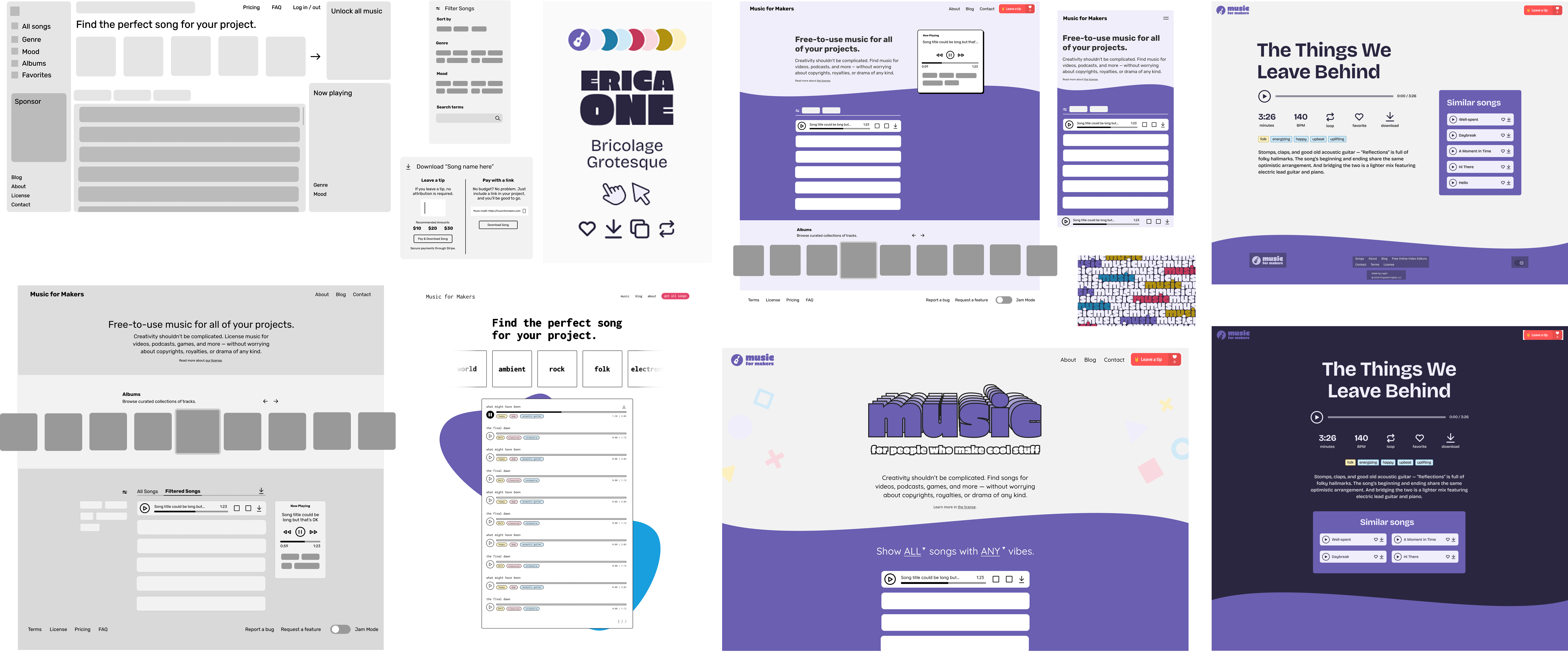
With a clear idea of what I wanted and what my users needed, I took a fresh look at the competitive and creative landscape for inspiration. Most music licensing libraries mimic streaming platforms like Spotify in their UX. But this felt like overkill for my smaller, boutique library. And, frankly, I find their designs rather sterile and boring. I was drawn to bold colors, clean strokes, less clutter, and more emphasis on delight.
So, starting with wireframes in Figma, I quickly explored various layouts. As I refined my direction, I moved on to higher-fidelity mockups, a simple design language, and, eventually, finalizing and polishing the design in the browser. (This is one perk of being a designer/developer hybrid. There's rarely a need to spend time creating production-ready page mockups.)
From an infrastructure standpoint, I made decisions that allow the business to effectively run on autopilot with little-to-no expenses, as it has ceased to be a key focus of mine. That translates to a very simple tech stack: SvelteKit (for its developer experience and speed), GitHub, and Netlify — plus Cloudflare for small things like keeping track of song download counts. Since I'm the only person working on the site, integrating a CMS seemed excessive. Markdown is just fine, thanks.
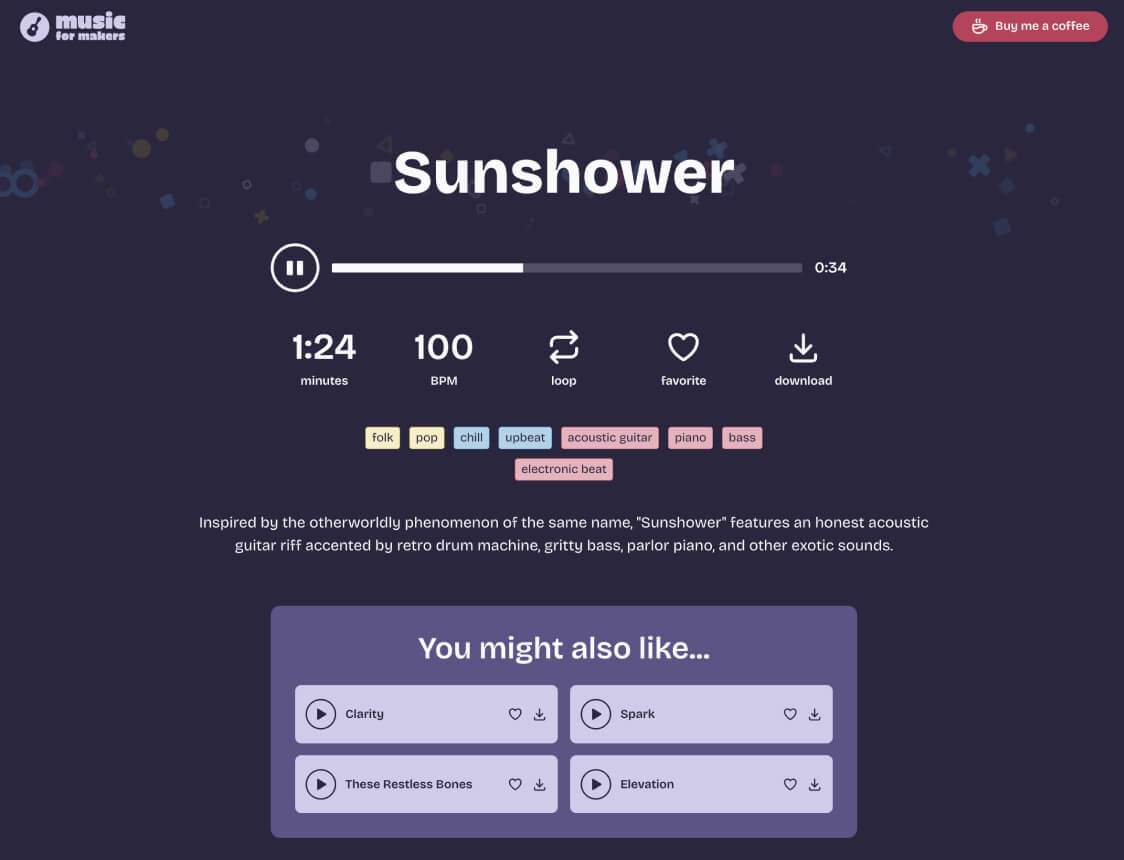
Challenges
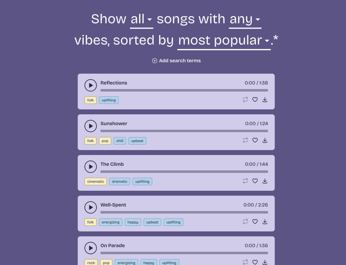
My biggest concern with the new Music for Makers web experience was nailing song search and filtering. After all, that's the whole point of the site — finding the right music for your project. But as it turns out, there's quite a lot of complexity involved.
For instance, I wanted to account for searching by genre, mood, and instruments, as well as support sorting by criteria like popularity, recency, and name. And wouldn't it be nice to allow people to save songs they like so they always appear first in the results? Let's not forget term-based search to help folks find songs that, say, loop seamlessly or sound like a retro video game. Oh, and users would probably expect to see song recommendations based on what they listen to.
Suffice to say, deciding on the best design, data structure, and engineering logic took some time and brain power. But I'm pleased with how it came out. And, according to the feedback I've received, so are users.
Results
The new site offers a highly streamlined experience that prioritizes ease of finding and downloading music. And less than 45 days after launch, signs of success were already apparent. Month over month:
- Improved performance. Pages load faster, boosting SEO and driving 77% more impressions and 56% more clicks from organic.
- Increased engagement. Users are signing up (1433% growth in email subscriptions), browsing (13% longer average active time), and returning more often.
- Satisfied users. Several people emailed to share their appreciation of the new site and how easy it is to use. And product analytics showed no indication of frustrating or confusing UX.
Music for Makers is now a pleasure to work on and a project I'm proud to showcase. Plus, I learned a lot. Namely, how to build a relatively complex site — featuring custom audio players and visualizers, light/dark mode theming, and more — front-to-back, from scratch, by myself, using a modern framework.
