Leveling up homepage visuals for Highlight
I illustrated and animated three unique scenes (as well as added motion to an existing hero image) to support brand messaging and product storytelling for Highlight.
Background
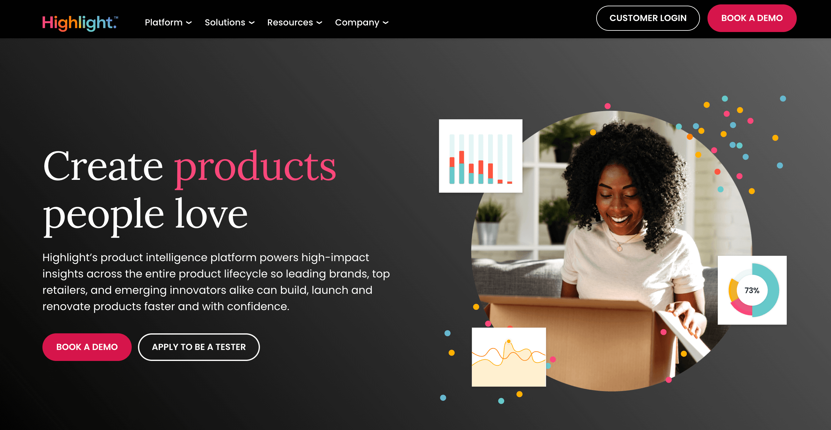
The marketing team for Highlight, a product testing company, commissioned me to elevate the company's homepage experience — specifically in the hero and a z-pattern section — through design and animation.
Highlight wanted to keep the hero image largely the same as it was, but with added motion. The z-pattern section, however, had very abstract and simplistic visuals that the client wanted replaced with more distinct animations. I had the existing copy to inform creative direction, but the task was relatively open-ended otherwise.

After sitting with the messaging and studying the brand, I began by creating low-fidelity concepts in Figma, storyboarding the intended motion. My goal for my designs was to help clarify and support the copy they would ultimately be associated with.
Process
The copy for the first animation underscored the software's consistency in test creation and reporting. I initially proposed a UI-centered concept that focused on the benefit of saving time by creating a new test based on a previous blueprint and having the two share a unified reporting dashboard. But the client was worried that a non-literal representation of the UI might be a hard sell internally. So, I pivoted, featuring just a shared reporting chart instead.
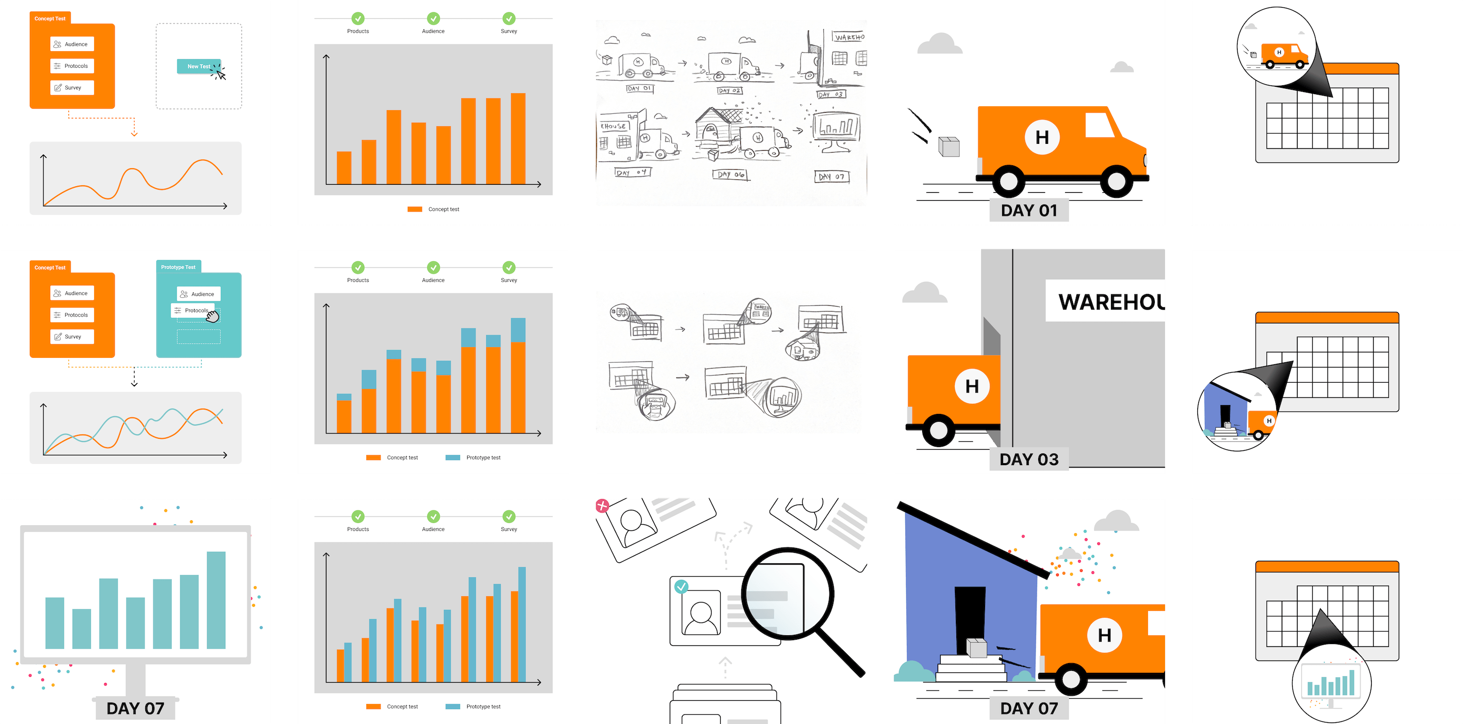
The second visual was more complex. It needed to showcase the company's unique ability to store test products in its own warehouse, ship directly to the audience, and report results in real-time — all in the course of just a few days. This led me to think linearly, and I proposed two options.
The first was an uncut scene that follows the test product from pickup to the warehouse to the tester, culminating in test results. The other option was a calendar view that zoomed in on individual days to show each step, emphasizing the short number of days the entire process takes. The client favored the first option. (It was my favorite, too.)
The copy for the last block of the z-pattern section spoke to the company's superior approach to sourcing and vetting testers to ensure quality results. In my mind, this messaging naturally lended itself to an animation showing a variety of applicants being reviewed and receiving a stamp of either approval or rejection.


After the initial review and any warranted adjustments, I moved on to high-fidelity, static designs — holding the time-intensive work of animation until I got approval on the polished graphics. Once that happened, I started the fun part: building animations with SVG and CSS.
I opted for SVG animations because they can easily be embedded, load fast, and rescale to any size with no pixelation. Plus, animating SVGs is kind of a speciality of mine.
Challenges
The hero visual contained a picture of a woman overlayed by the illustrations that I was to animate. This presented a few hurdles because exporting and animating an SVG with an image results in a massive file size.
Typically, the ideal solution is to add a reference to a raster image file that's hosted somewhere else, much like you would do for an image inside HTML. However, this option didn't work due to the content security policies of the Highlight website.
The next best option is to create a layered visual out of two separate DOM elements: an HTML img for the raster image and an SVG for the animation. This was ultimately what I did for Highlight.
The other visuals were relatively straightforward, though some animations were quite complex to build — particularly the uncut scene showing the speedy process from package pickup to data delivery.
Results
The new visuals give the homepage more personality while reinforcing brand positioning. And because I used SVG, there was no impact on page load times. I call that a success!
It is so difficult to turn an abstract concept into a visual. Plenty of people can take a vision and polish it into beautiful graphics, but where I really valued Logan's input for our new homepage motion graphics was the challenge of taking our brand positioning and unique selling points from words in a brand guide to a fully fleshed out, on-brand, and fun set of graphics that clearly convey the value of what we do for our customers. I love the final product (go see them at letshighlight.com) and would highly recommend Logan as a great partner to work with!

Chelsea Stone
Senior Digital & Content Marketing Manager at Highlight
